
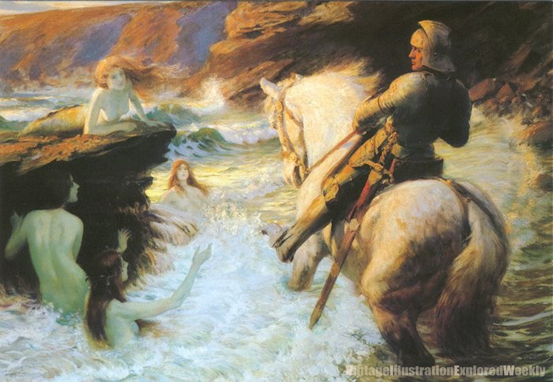


 A little over 10 years ago, Dover published a 6-card postcard book that I compiled on Mermaids in Art.
 It was my second effort in pulling together Victorian or Golden Age art into a book (ok, a really small one here) of any sort. There was one piece I really wanted to use in that collection, but despite a good deal of effort, we could not discover exactly when the piece in question had been done, what it was done for, and therefore could not discover if it was truly a public domain work or not. So we let it go. Every once in a while I see the image again, and it continues to be a favorite. Enough so that I dug up some more info on it's artist, but still I am no closer to discovering the date or exact origin of the piece.
The piece I speak of is The Enchanted Shore, by Rowland Wheelwright (1870-1955) (Shown here as the first piece) The piece is heavy on Romantic influence, and has three of my favorite elements to work with—a mounted knight, mermaids, and crashing surf— and it's sunset/sunrise, so the light is fantastic. Wheelwright's painting style is somewhat influenced by the Impressionists, while his choice of subject is largely pre-Raphaelite.
Born in Australia, Wheelwright's family raised sheep. After a particularly tough drought in 1891, his family decided to return to Europe, settling in England. Wheelwright later studied at Hubert von Herkomer's (also a favorite, now it makes more sense) School at Bushey, and lived and worked in that area for most of his life. He remained a prolific artist, and showed work frequently at many of the academies and with societies he had affiliation with.
After some fresh research, I like Wheelwright even more. And it appears he was the victim of some awful reproduction over the years— see pieces two and three, with comparisons. The Don Quixote piece was familiar to me only as a bad black and white reproduction. When I began to look, I found the oil it was from, and the color and time-of-day it captures is fantastic. Another book plate, this one showing Joan of Arc, appears bright and simple. The second version of it (below, 3) shows a much richer range of value, with the bright spot really directing the viewer as it should be, giving a spiritual quality to the piece almost entirely absent from the brighter reproduction. [Correction, these are not actually the same piece of art. The brighter one was likely either a sketch, or a copy done (maybe by someone else!) for the purpose of putting it in the book.]
Also here- A more typical book illustration from Ivanhoe, 1926, and a beautiful image of two young woman in a field of flowers. Can't locate a date on that one, but based on the costume and the hair, it could be 1925-193(8?). Again, great sense of light.
------
Four more followers until I give away four more books. If you can't message me, leave a comment that you're interested.
------
My absence from more regular posting is not by design, but by necessity. In addition to teaching a night class this semester, I have two large new book projects in the works, (and a third almost finished) which are keeping me very, very busy. Back when I can be. Jeff