Wednesday, August 21, 2013

A Reclamation, and Reward

The painting, as I found it on ebay.

OK, here's a story that's a bit different. It's about rescue and restoration, and a whole different aspect of illustration appreciation. It's also something that will become more and more important in years to come, as so much illustration art was not regarded as worth saving in its day. Much of it was done on and with inferior materials, and a great deal of it was considered little more than the means to achieve an end (the printed product), not seen for the value it had in and of itself. Saving this art today preserves illustration history, and can make for good investment.

About two years ago, I had provided an entry on William James Aylward, 1875-1956.  In my eyes, he is one of the most overlooked gems of the Brandywine alumni. We have a lot in common; and I may be biased due to a few of those similarities—I collect his work with some serious intent, there may be only one other artist I seek out with more enthusiasm. So when I got notice that something new from Aylward had posted on ebay late last March, I expected more printed pages from Scribner's Magazine, or an illustrated copy of Jack London's The Sea Wolf. I got a pleasant surprise.

The listing was for a 16'X20" painting, signed by Aylward, and it is without a doubt, his. OK, I have a nice pencil piece by him, and recently acquired an ink sketch as well, but I hadn't thought I might be able to find a painting, at least on ebay. And it was reasonable. It was pretty dirty, definitely had seen better days, but I wondered if the sellers really knew what they had. It had a "buy it now" price, and I took it right away. They probably did know what they had, and more precisely, they knew what needed to be done. But that's what allowed me to have a chance at this piece in the first place.
A few pieces by Aylward done in a similar fashion. The two-tone work he did for Scribner's or Harper's were often small vignettes, black and orange. These are from 1918. Today, I live in Huntington Township, not far from where this scene was painted.


The sellers asked me if I was sure (odd for ebay), and cautioned me that the piece needed some restoration. I carefully looked over the images provided, and was still good with it at the price they offered. So it came. I wanted to have it cleaned up—or at least looked at—to see if I had saved something, or just let go of a small wad of cash. I called The Society of Illustrators—to ask who they used to clean up works for them. I knew this wouldn't be cheap, but If I was going to have someone look at it, I wanted it to be someone who understood this type of work, and maybe even was familiar with Aylward. They recommended Pratzon Art Restoration in Manhattan, and it could not have been a better fit. Not only was Jill Pratzon familiar with Aylward, she specializes in illustration of this sort, and had worked on some Aylward before. While the restoration was more than the painting was, the two prices together cost me about as much as I might have paid if I had found this piece in the shape it's in now, in an auction catalog. So, I went ahead, already being somewhat invested in time and money. She did a fantastic job, and now I have a sweet original painting by one of Howard Pyle's students.
Restoration—in process—photo by Jill Pratzon.


And the finished piece.


Monday, May 27, 2013

Unsung Louis Rhead


This is a return I hope that I will not need to repeat. Having been working on VIEW for over four years, I haven't needed to step away this long before—but those of you who are aware of my activities outside of VIEW, may know that I have been deep in a project over the past few months, which has all but engulfed me. I'm looking forward to getting back to VIEW much more regularly again. Here's one that's been stewing all this time.

Born into a family of ceramic artists, Louis Rhead (1857-1926) showed exceptional artistic talent early on, and was sent to study in Paris from his home in England at the age of 13. More study followed upon his return to England, and by 1881, Rhead left the family business of ceramics and began a career in publishing at Cassell in London.

The Snow Queen
Hans Andersen's Fairy Tales and Wonder Stories
1914

Rhead was not long at Cassell before he caught the attention of a New York publishing firm, D. Appleton.  He accepted a position as art director from them, and settled down in New York where he brought an element of Parisian Art Nouveau to an eager American audience.

During the 1890’s, the poster became a popular medium, and Rhead was in a great place to take advantage of it. He became one of the leading figures of the American Art Nouveau movement, and during most of that decade his graphic work regularly appeared in association with "Century Magazine", "Harper’s" publications, and "Scribner’s", among others.

When poster work began to decline, Rhead found new direction in the growing market for book illustration—where he became a contributor in the market of children’s classics. He regularly produced volumes with tremendous amounts of line illustrations, sometimes recalling the graphic styles of his earlier poster designs. Rhead produced many memorable volumes, including Treasure Island, Robin Hood, and Robinson Crusoe.

Rhead’s second passion in life became angling.  It was not long after the turn of the century that Rhead’s artistic talent and his interest in fishing joined—and in the latter part of his career—he not only illustrated numerous books on the subject, but became an expert on it, and an author as well. Illustration centered around fishing found markets in his own books, and in the early sporting magazines of the day, such as "Outdoors", and "Field and Stream".

In 1926 it was a fishing adventure that would end Rhead’s life. After an hour-long struggle with a 30-pound snapping turtle, Rhead landed the turtle, but the strain proved too much for him; he suffered a heart attack. Two weeks later a subsequent heart attack ended his life, at age 68.
Vivien
King Arthur and His Knights
1923
Hans Andersen's Fairy Tales and Wonder Stories
1914


Sunday, January 27, 2013

There be Dragons

A Changing of the Guard

Although my life is steeped in books, I try to not rely on "book review" type of columns for this blog. Once in a while I encounter a volume special and unique, and it can't be helped. This tale—however—marks a transition of sorts, and that change is almost as worthwhile a discussion (although another one all together) as the art that brought it to my attention.

But first, this new batch of art. A few years back a portfolio of naturalist-type plates was brought to my attention at Dover Publications. They were big plates, nearly 30 of them, and in a wide range of color. (Chromalithographs, not process color)  From 1896-1909. Some incredible fish, crustaceans, and birds. The real surprise was that there were dragons. Worked in, right with all this terrific real world stuff, were a nice range of different types of dragons with an Art Nouveau flair. Killer stuff, really.

Finding info about the artist, Anton Seder (1850-1916), isn't easy. He was from Munich, and did a number of botanical and zoological plate sets, some in conjunction with other artists. in 1890 he became the Director at The College of Decorative Arts in Strasbourg (France or Germany, depending on the period) for twenty-six years(?). One has to wonder what inspired the addition of the fantasy element in this set, but it's very refreshing for the period. (a nice bunch of decorative samples)

------

OK. But that's not the transition I'm talking about.
The difference here, is that the set was released by Dover last month, but only in digital form. You can get it in all it's hi-res glory, for just a few bucks, but it's not in print.


If you are not aware, Dover is selling it's image libraries online now, by page or by collection. As you might expect, all of its clip art that has been available on disc, is now available there. But now, new material, never before available, including Anton Seder's Dragons (& company) is available as well. And new collections will be added constantly. So if you enjoy digging through images of all kinds (If you didn't, you wouldn't be here) keep an eye on www.doverpictura.com.

The site is still in development, but improvements are happening constantly. If you have a suggestion for the site, contact them there.


Plates from this and other Seder sets, from an art dealer—


----

Wahoo! VIEW broke the 100 follower figure! I have books of choice to send out to the following five lucky followers.
I'll try to get in touch with you for mailing info, or you can track me down as well. Thanks everyone.

Stephanie Pui-Mun Law
Ava Plum
Heather Hudson
Jason Juta
Stephany Benbow


Saturday, December 29, 2012

Heinrich Kley, Grand Master of Ink


It seems regardless of my direction these past few weeks, I keep getting pointed to the work of German illustrator and artist Heinrich Kley (1863-1945). Comparably, few know of his work, but it is often held in high regard among those that do. Kley is about to get some attention that is long overdue, and it is worth making sure that more people are aware of his work and the new books on the way.

I found (almost literally… I bought them from a street vender) two volumes that Dover had published of Kley’s work while I was an undergraduate student in the mid-eighties. The copies I bought were twenty years old then. I was stunned how much the imagery reminded me of the ink work Jeff Jones produced monthly for Heavy Metal Magazine, in a regular strip Jones called "I’m Age". The work was incredibly loose, fluid and refreshingly sketch-like, but had beautiful clarity where it was most deserved.


Kley first appeared in German periodicals out of Munich around 1907. Previous to that he'd been in fine arts and a book illustrator. His work from the next decade often comments on social and political issues, and not unlike his contemporary Charles Dana Gibson, he often sought out subject matter depicting the struggles between the sexes.

The two Dover volumes I mention above gave Kley a small but loyal following here in America, but he was otherwise nearly forgotten about. The first one, The Drawings of Heinrich Kley, is still in print.

Sometime last year I got hold of issue eight of Jim Vadeboncoeur’s Images magazine, (I highly recommend it) which featured numerous color works by Kley, and also pointed out that he regularly contributed color work to German magazines of the day, including one called Jugend. The color plates I have here are all from Jugend, 1911, while the line works are from those Dover collections mentioned above.

A friend with an eye on VIEW—Tom Kidd—pointed out to me recently two new volumes of Kley’s work are about to be—or have recently been—released by Lost Art Books. These two volumes feature hundreds of Kley’s images that have not been reprinted for near a century, in some cases, more. Scoop them up while you can. Bud Plant announced them yesterday on his page as well.

-----

While I’m currently consumed by two large projects, VIEW is not getting the attention it deserves from me, but it is very much in my mind and I will maintain it as frequently as time allows.


VIEW needs ONE more new follower until I send five folks their choice of any of the Dover books found on my Author’s Page at Amazon. If you are interested in receiving one of your choice, just let me know in a comment. I’ll be in touch with five randomly selected winners as soon as we hit 100.

Have a happy and safe New Year!!   Jeff


These tortoises were definitely the inspiration
for the cover of the Grateful Dead's "Terrapin Station"


Saturday, November 17, 2012

There are still treasures to find


While I'm still tied up in a crazy amount of work, I've had to find a way to mention some of the things that have happened this past few weeks—and—share an amazing Golden Age find with you.

In the last week I spent four days at Illuxcon, in Altoona, PA. If you are unfamiliar with the name, it is a convention focused on art—particularly—that of the genre coming to be known as Imaginative Realism. (A term made relevant by the esteemed artist and author James Gurney) It is traditional work that is featured here; while digital imagery maintains a presence in lectures and discussion, original paintings are the stars of this show.

I mention the show here because almost no other audience than the people working in this field has a greater appreciation of the art I discuss on VIEW. There is a lot of cross-referencing and respect for Golden Age material. The mission of Illuxcon, it's benefit and support to those working in the field, is unsurpassed. If you are a fan of this material on VIEW, you would undoubtedly appreciate and enjoy what they are doing at Illuxcon as well. You can check them out at http://www.illuxcon.com/

Next years show is being moved to the Allentown Art Museum during the month of September. Sign up To their facebook page here.

-----------


A while back, I introduced you to the French artist Maurice Boutet de Monvel, and his book The Story of Joan of Arc. Now I have news of another French illustrator and a magnificent book published in 1910…    A good friend recently emailed me that she had stumbled on a book at a library fundraiser that she thought I would really like. I kept my expectations low, as I'm often directed towards books I’m already aware of, but this turned out to be the kind of thing I’m hungry for. Thanks, Mary.

Maurice Lalau (1881-1961) appears to be well-regarded in France, but it is not a name I have come across much before. (Dover does print an edition of East o' the Sun and West o' the Moon that contains a few of his illustrations, but they do not compare in quality to these)

The book that seems to be one of the highlights of his career is this Heinemann (who was also publishing Rackham at the time) volume titled The Romance of Tristan and Iseult. It contains 20 color plates, and some beautifully drawn illustrative cap letters.  Text by Joseph Bédier. The color work has some brilliant range for the period, the draftsmanship—especially the architecture—is remarkable, and the emotion behind these illustrations might bring more comparisons to J. W. Waterhouse than other book illustrators of the period. While The Romance of Tristan and Iseult appears to be quite scarce, I’m not the first to blog about it, and if you thirst for more of these images, the whole group has been posted here. (where you can also find some comments about the color in my Dover books…I think I may need to address that one week…)

--------

Still looking for three more followers until the book giveaway. Sign on if you haven’t, and comment or message me that you are interested in free art books…


Saturday, September 22, 2012

Painter/illustrator Rowland Wheelwright


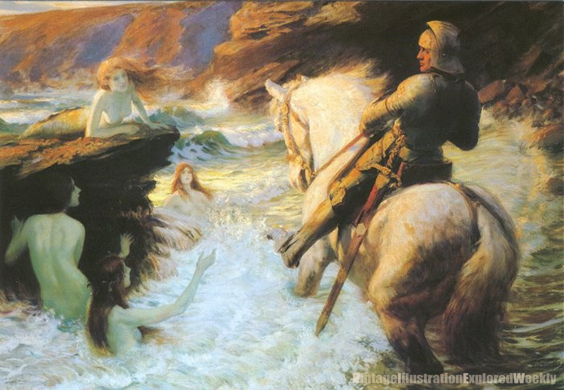
A little over 10 years ago, Dover published a 6-card postcard book that I compiled on Mermaids in Art.

It was my second effort in pulling together Victorian or Golden Age art into a book (ok, a really small one here) of any sort. There was one piece I really wanted to use in that collection, but despite a good deal of effort, we could not discover exactly when the piece in question had been done, what it was done for, and therefore could not discover if it was truly a public domain work or not. So we let it go.  Every once in a while I see the image again, and it continues to be a favorite. Enough so that I dug up some more info on it's artist, but still I am no closer to discovering the date or exact origin of the piece.

The piece I speak of is The Enchanted Shore, by Rowland Wheelwright (1870-1955) (Shown here as the first piece) The piece is heavy on Romantic influence, and has three of my favorite elements to work with—a mounted knight, mermaids, and crashing surf— and it's sunset/sunrise, so the light is fantastic.  Wheelwright's painting style is somewhat influenced by the Impressionists, while his choice of subject is largely pre-Raphaelite.

Born in Australia, Wheelwright's family raised sheep. After a particularly tough drought in 1891, his family decided to return to Europe, settling in England. Wheelwright later studied at Hubert von Herkomer's (also a favorite, now it makes more sense) School at Bushey, and lived and worked in that area for most of his life. He remained a prolific artist, and showed work frequently at many of the academies and with societies he had affiliation with.

After some fresh research, I like Wheelwright even more. And it appears he was the victim of some awful reproduction over the years— see pieces two and three, with comparisons. The Don Quixote piece was familiar to me only as a bad black and white reproduction. When I began to look, I found the oil it was from, and the color and time-of-day it captures is fantastic. Another book plate, this one showing Joan of Arc, appears bright and simple. The second version of it (below, 3) shows a much richer range of value, with the bright spot really directing the viewer as it should be, giving a spiritual quality to the piece almost entirely absent from the brighter reproduction. [Correction, these are not actually the same piece of art. The brighter one was likely either a sketch, or a copy done (maybe by someone else!) for the purpose of putting it in the book.]

Also here- A more typical book illustration from Ivanhoe, 1926, and a beautiful image of two young woman in a field of flowers. Can't locate a date on that one, but based on the costume and the hair, it could be 1925-193(8?). Again, great sense of light.

------

Four more followers until I give away four more books. If you can't message me, leave a comment that you're interested.

------

My absence from more regular posting is not by design, but by necessity.  In addition to teaching a night class this semester, I have two large new book projects in the works, (and a third almost finished) which are keeping me very, very busy.  Back when I can be. Jeff 

Sunday, August 19, 2012

This is a search unfinished.


In long-ago days of my youth, my quest for the sources of great tales lead me to read a lot of Celtic mythology—something I still seek out. I had an old reprinted copy of Celtic Myth and Legend Poetry and Romance, by Charles Squire originally from 1905. My copy then was an English reprint, but Dover publishes it as well, but I'll have to check to see if they printed it with the illustrations or not. I'll get back with that info shortly. There were a few plates among the stories—and the stories themselves—that gave me exactly the kind of thing I was looking for. The art I liked the best within that volume was by an illustrator I had not heard of before, but have kept in the back of my mind, well, for a long time.

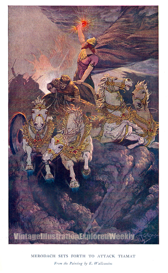
Ernest Wallcousins (1883-1976) was a British illustrator, who spent some part of his career working with a studio known as Carlton Illustrators, in London.  Despite scouring my usual sources, and then some, I can find very little info on this artist. Kind of surprising considering he was alive just a generation ago.... But I don't find that a reason to not share some of his work, maybe some of you will find it as inspiring as I have. And if anybody out there has any info on him, PLEASE get back to me about it.

Top to bottom. Three plates from Myths of Babylonia and Assyria, by Donald A. Mackenzie. Same series as the Celtic myth book previously mentioned. The color plates in here are great, all of them from the volume can be seen here.

Two from Pioneers in Canada, by Henry Johnston. I was expecting Henry Hudson and the like... what I got was a lot of outdoor/wildlife images, something else that appeals to me quite a bit. I may post the rest of these as a follow-up in a few months.

A Cover from Bibby's Annual, 1921. Wallcousins seems to have owned this task for quite a few years, producing covers that have a real poster-like quality. Not unlike the image from the myths above—he may have had a thing for chariots.

Two of the "monochrome" plates from Celtic Myth and Legend Poetry and Romance, that put me on his trail in the first place. I've been looking for years, but I've never been able to track down any full color printings of these pieces. They may have been published earlier in color, or, maybe they were only printed this way. (The Dover edition features a Wallcousins image I tinted for our cover.) Maybe you can tell me.
--------------------

We are almost at a century mark for followers. When we hit it, I'll take time to send out a few of my Dover books (YOUR CHOICE!) to 5 interested persons. If you're interested, message me as much. I've signed on as a follower to my own blog(?), so this communication can happen, so make me glad I did....


Wednesday, August 1, 2012

Fine Lines and Solid Blacks, Vol. V


It has come to my attention that sometimes in discussing the more interesting facets of an illustrator, some of the "basics" can be overlooked. Take Harry Clarke (1890-1931) for example. Harry Clarke is one of my favorites of the period. Over the past few years there has been a VIEW post on some really hard-to-find Clarke works, and he was mentioned again in reference to a collected work, more recently. To not offer a look at why I think he's worth some more study, is just, well, wrong. So let's fix that.

In the small amount of time that Clarke had to share his genius with the world, he managed to explore a few creative avenues. Stained glass design may be what he applied most of his time and talent to, and in his native Ireland there still exist many examples of his fine glass work. I found Harry Clarke while in my teens, during an after-Christmas book sale, when a reprint of Poe's Tales of Mystery and Imagination came into my possession. Like many designer/illustrators of the Golden Age, Clarke had the opportunity to do a number of gift books, his were from 1915-1925. The Poe volume is his best known, and easiest to obtain a reprint of. (It was one of the first selected for the Calla reprint program, as well) Clarke's others are not as easy to find, though a reprint of his Fairy Tales of Charles Perrault will be available this Fall. Another of Clarke's prizes is his Fairy Tales by Hans Christian Andersen. All of the works shown here come from that volume. I'm looking at Clarke in a Fine Lines and Solid Blacks segment because I think his ink work is exceptional in his use of pattern and understanding of value—value here meaning the transition(s) between blacks, grays, and whites, and how their relative placement on the picture plane affects the composition. A viewer can observe these images at a glance, or choose to dig deeper and deeper into them, where a single plate can tell its own story. Clarke's color illustration doesn't present with the same intensity through simplicity—black and white—and loses something in the printing, according to some who have seen his originals.


There has been a kind of scholarly-reawakening in regards to Clarke in the last five years, but it does look to his glass work primarily.

You can keep up with that here
and as mentioned in that earlier VIEW blog, here's the link to Jim Vadeboncouer's page on Clarke.


Back shortly. Jeff


Wednesday, July 4, 2012

W. H. Robinson, with even more Kipling


Last October, I put up a post about some beautiful color work by W. Heath Robinson (1872-1944). The imagery up at that time was from The Song of the English, a long poetic piece of writing by Rudyard Kipling. It was one of the first books I acquired while working on my next Dover outing, Golden Age Illustration of W. H. Robinson. Now I bring it around full circle, to the last book I picked up for that same project.

While lacking the amount of pieces that show up in Song of the English, this volume of Kipling Poetry— Collected Verse— has some masterful imagery as well. I almost passed up acquiring it, it has comparatively few color plates— but I stumbled upon a a 1910 Doubleday copy, with all the art, and a nearly detached cover...that I got very reasonably. So let me share a few of these with you, as a preview of the upcoming book. As for the illustrative years of W. H. Robinson's career, (who later went on to become a very successful cartoonist, leaving more traditional book illustration to others) the works he did for these two Kipling volumes in 1909 and 1910 are among his best. Other books that will be featured in the upcoming Dover work include images from The Water Babies, A Midsummer Night's Dream, and some of W. H. Robinson's own writings— Uncle Lubin and Bill the Minder.

Next month at some point, I'll bring out some of the best work from his older brother, Charles.

---------

Return from the Edge

I've been to the Edge—and it was terrific. If you have ANY CHANCE AT ALL to get to the show mentioned in my last post, don't let it get past you. Three big gallery rooms, packed with a wealth of the best fantastic creatives out there. Thank you, Pat and Jeannie, and thank you Allentown Art Museum.


Wednesday, June 13, 2012

Summertime is Time to Travel. The Wonders We Will See!


Being up to my neck in large scale projects this week—and for quite a few more to come— it's been easy to let days slide away, but I'm determined to attempt to maintain some regular connections.

Before any more time goes by, I have to alert VIEW's readers to two amazing shows currently on display in the Northeast corner of the US. The first is from some folks I'm proud to call friends, Pat and Jeannie Wilshire of Illuxcon fame have guest curated an exhibit now on display at the Allentown Art Museum in PA.

At the Edge is a show unlike any other I've ever known to have been assembled. It contains the best in "fantastic" art, (in the sense of "fantastical") from nearly 150 years ago up to the best Imaginative Realist painters going today. The list is mind-blowing. While the current crop of top illustrators makes an annual appearance at Illuxcon and is well represented in this show, it is the historical (i.e. "vintage")  stuff that this blog focuses on— and WOW, they've pulled some masterworks out from private collections (The Kelly Collection, and The Korshak Collection, and others). This is an extraordinary opportunity to see some outstanding pieces, from many of the artists that we discuss here with some regularity. Shown at the right, Dean Cornwell, Wladyslaw Benda, Edmund Dulac, J. C. Leyendecker and Franklin Booth... All in one place. Thanks to the Wilshires for permission to repost those images here on VIEW.

The Allentown show runs until September 9th, and appears to be continually hosting lectures by the biggest and the best. The Wilshires themselves will be there this Sunday, to present  a lecture on the imagery of the fantastic—Imagining Reality with Pat and Jeannie Wilshire (Roger Dean will be there a week from now...)  They are doing so much to help fantastic imagery get the respect it deserves. Worth a vacation day, for sure.

AND IF THAT'S NOT ENOUGH

The Howard Pyle Centennial exhibit is showing again, now located at the Norman Rockwell Museum in Stockbridge Mass.

If you weren't able to make it when it was at the Delaware Art Museum, It will be in Mass. until October 28th. I posted some comments on the show when I first saw it, but I am planning on seeing it at the Rockwell also.

Time to hit the road.