Thursday, March 22, 2012

An Officer of the Society


This ALMOST would have been an entry for the "working class illustrator" column. Some solid work from someone you've likely never heard of. Almost. Then James Gurney (Yes, THAT James Gurney) brought this portfolio of work to our attention at Dover. Two portfolios, actually, originally published in 1920. Two printed portfolios of figure studies, all done from life.

Arthur Ignatius Keller (1866-1924) was one of the founding members of the Society of Illustrators, and became the president in 1903. Better than adequate, Keller was a regular to most of the big magazines of the day, and did some book work as well. His 1906 Sleepy Hollow is a real gem of a find, jammed with details and sketch work, even if perhaps a bit overdone by today's standards. When I was asked my opinion on Keller's drawings from life, I concluded that if Dover would print it, they had already sold a copy to me. His ability to capture a communicative gesture, in both a quick study or in a drawing full of deep shadows and hot highlights—shows a dedication that paid off handsomely.

The original 1920 edition is prints of photographs of the art. The collage type approach that makes up the pages was often uneven in its tone, so for the Dover edition it was decided to even the background, while preserving the line work and the white chalk as well. The two color treatment used to reprint the 90 year old works gives a nice sense of warmth, without flattening out the tone. It's great to have these masterful renderings available for anyone who wants to see them, or study some good drawing. Shown here, 2 pages from the portfolio, a pair of magazine illustrations (?) and lastly, one of the full color plates from that 1906 edition of The Legend of Sleepy Hollow—

Jim Vadeboncouer's Keller bio—


A nice lengthy bio of Keller on a site about Sherlock Holmes illustrators—

Sunday, March 4, 2012

A Mad tea-party, not a Mad Hatter...

Did you know... that Carroll never uses the phrase mad hatter? The readership has adopted that term over the years. It was the party, that was described as a mad tea-party...


Well, this is a nice development. A few topics on deck, and my latest Dover "image collection" comes in a bit ahead of the latest predictions.... so I find myself with the new material to give you a glimpse of, and a leg up on next entry. All good.

I will admit, that when Dover asked me about doing a collection of illustrations focusing on Lewis Carroll's Alice, though I knew there was a lot of good material to look over, I wasn't sure I'd find enough to keep me interested. It didn't take long before I realized that these few volumes full of over-the-top imaginative stories provide some outstanding material to interpret, and many of my illustration heroes had—well—gone down that hole.

The spark for this project was a chance meeting almost two years ago, with Mark Burstein—President of the Lewis Carroll Society of North America. Mark's knowledge of Carroll's work and the depth of his own collection made him a great partner for this volume. Not only did Mark provide a great introduction to the book, but he was able to guide us to some rare material, and lend us a few editions to work from that otherwise might have been unattainable. Kudos to you, sir.

In all there are images from 16 different illustrators of Carroll's works. From a selection of Sir John Tenniel's work in the original editions, to Arthur Rackham and a wide array of Golden Age art, and finishing up with some great wood engraving by contemporary artist/illustrator Barry Moser.

Shown here, top to bottom, A. E. Jackson, Charles Folkard, A wonderfully eerie ink piece by Charles Robinson, Gwynedd Hudson, (who also did the image chosen for the volumes cover, shown as well) and a wondrously different "ginger" Alice, by Mabel Lucie Attwell.

Wednesday, February 15, 2012

A Brandywine Moment


Some weeks ago I was tooling down I95 on the east coast, bringing my son to school in Baltimore after his Winter break. (I know! I can't believe I'm old enough to do that either!) Here was a golden opportunity to see one of the exhibits I've been waiting for, actually for years. The Howard Pyle show that marks a century since his passing. It was practically on our way, and I was not about to just pass by. I'd been making some noise about it, so everyone in the car knew we would be there for a bit.

The Delaware Art Museum in Wilmington, was founded in 1912 with the purpose of gathering and housing Pyle's work. It has become one of the premier museums in the country concerning Illustration, and they have a nice handle on Pre-Raphaelite works as well. I've seen a lot of Pyle's works over the years, and I'm familiar with a broad swath of his imagery— I was keen to see what might surprise me there.

Most of the important works are there, Attack on a Galleon, Marooned, and one on my favorites, The Flying Dutchman. I still can't get over the size of that piece, it's enormous, almost 6' tall! It's obvious that some pieces he did for love of painting, and some were assignments. Here's two that caught me off guard.

The first is a piece —the Angel—I used to close my Dover plate book on Pyle. Why seek Ye, the Living Among the Dead? is a real exercise in contrasts and value control. What surprised me was that the original, as photographed here, is so much lighter overall than the reproductions I've become familiar with. Another was this image in gray, or en grisaille, (Pyle and others painted this way sometimes to better suit works to be interpreted by engravers) from Hawthorne's Wonder Book (Stay tuned for more on that ...) The edition with the Pyle illustrations is quite scarce, and I hadn't had a chance to see these before. The light in the piece When All the World was Young was phenomenal, it absolutely glowed from across the gallery room. There is a homestead in the distance at the furthest visible point, very specific, I imagine it must be an actual location. Any ideas?

The show is at the Delaware Museum until March 4th, when it travels north to the Norman Rockwell Museum in Stockbridge, Mass., (where I will undoubtedly see it again) June 9th to October 28th. The book that accompanies the exhibit may be the best book on Pyle's work to date, I highly recommend it.

————

Lots to come in the next few weeks...including the new collection Alice Illustrated—back shortly.

Tuesday, January 17, 2012

Welcome to Sherwood


In an age before what is now known as "gaming".... before The Lord of the Rings had hit the big screen in any form, there were a different set of mythic heroes. They are still around, but they don't command the stage they way they did in a time before role-playing, blu-ray, and the "six-book series"...

Books that were read over and over, stories told for generations, were some of the tales that got the royal treatment when it came to illustrated editions that appeared near the turn of the last century. One such story that has always grabbed my attention is that of Robin Hood. I've always enjoyed that period in history, and that particular story. Many 1900 era publishers saw the appeal to the tale as well, and many saw fit to add it to their list at one point or another.
Of my illustration collections that Dover Publications has published, most are thematic by artist, but some are compiled by subject. The first of these was Illustrations of Poe, and the Arabian Nights illustrations were particularly well received. There are a half a dozen or so such titles now, but Robin Hood didn't grab the publisher's interest. I've collected quite a few editions, and thought it could be of some value to share them here on VIEW. Comparing how different artists look at the same story helps you find distinctions, that may help your own illustration or just enjoy one group more than another.

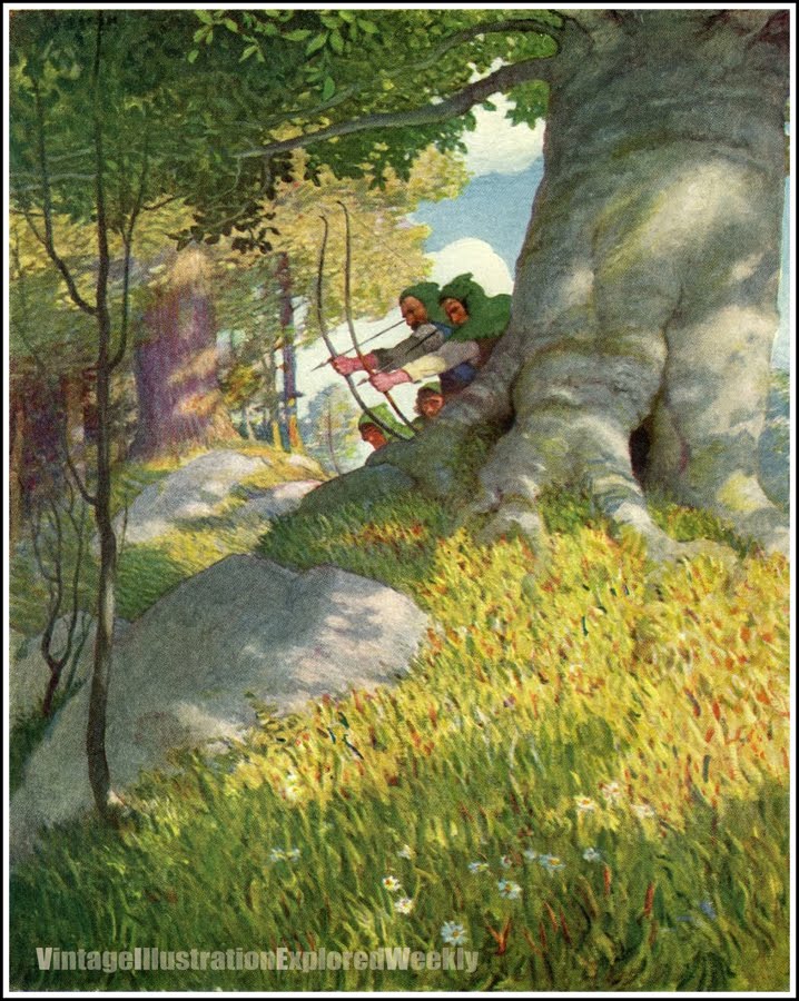
Some of my favorites—Walter Crane (top) near the end of his career, did Robin Hood in 1912. H.J. Ford (second) did his as part of The Book of Romance, in 1902. Howard Pyle's version (third) is full of premier quality line work, and was rewritten by Pyle as well, "to better suit the modern reader". Pyle's version is still reprinted today, and is often the version chosen for text when someone else throws their hat into the "Robin Hood Illustrated" ring.

An unusual arrangement took place between Frank Schoonover (fifth) and Louis Rhead, (fourth) where for a decade or so, books were produced with Rhead's line work, and a color Schoonover cover plate—even though Rhead got occasional color interior work. N. C. Wyeth's oil paintings (sixth) are among some of his best works for Scribner's Classics, and Frank Godwin's brilliant color plates from his 1923 edition (last) almost seem to mark the end of the era. (and these are just the tip of the iceberg...)