Monday, December 27, 2010

Snowday, Wyeth style


I start this post in the immediate aftermath of a Northeast blizzard, one strong enough to shut down the railroad, and grant me a snow-day to follow the Christmas break.

It occurred to me that a new bunch of N. C. Wyeth (1882-1945) prints that have trickled into the studio share this wintry vision. Living where I do, it's not uncommon to see some snow on the ground from December to March, and it always surprised me that it doesn't show up in more work, from anyone who lives in the north. N. C. must've liked the snow as well, because looking over a group of his early works, a large percentage of them are snow scenes, including one of my most favorite Wyeth pieces. Seemed like a good theme to explore on a snow-day. Without taking it for granted—Newell Convers Wyeth is one of the most important illustrators of the twentieth century. He joined Howard Pyle, studying under him at the Brandywine, and Wyeth soon became Pyle's star pupil. Wyeth had an incredibly prolific career in both book and magazine work. He was also the patriarch of what became America's first family of art, with his son Andrew Wyeth, and grandson Jamie Wyeth being the central figures of three generations of Wyeth artists.

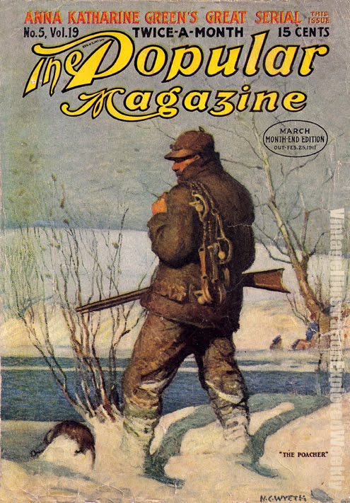
The images— a few nice covers from The Popular Magazine, including this cover with a Yukon adventure look to it- Polar bear, Native Americans, a trusty Colt .45. A second features one of N.C.'s strong solitary thinkers, in this case, a poacher...
A few plates from The Outing Magazine, January 1907- from a story entitled "How they Opened the Snow Road"
and a pair of plates from two classics—
The frontispiece from Mark Twain's last novel, The Mysterious Stranger (a read which I enjoyed tremendously in my college days)
and a piece I have the highest amount of respect for, from Robert Louis Stevenson's The Black Arrow, (also a good read)

Wyeth used snow in many of these pieces the way he used dust in his even earlier (or contemporary) western themed works—providing a light field, it helps him to increase contrast and strengthen shadows. He also frequently simplified figurative areas into definitive shapes, and obscured the details of distant backgrounds that would otherwise distract from the focus of the piece.

Stay warm. See you in the New Year, here's to a good one!

Saturday, December 18, 2010

Ring out Solstice Bells


The Solstice arrives this coming Tuesday. Marking the longest night of the year, it has special meaning to many people. This year's is especially spectacular, as it is not only coupled with a full moon, but also a FULL LUNAR ECLIPSE, visible all over the US. Holy Druids.

These old-world calender events always make me think of the myths and legends that make use of such happenings. Having just acquired a long sought-after book featuring some great pieces from Celtic myth, this seems like an appropriate enough occasion to share them.

Stephen Reid (1873-1948) is not a name you will come across in any (but the most thorough) of the books on Golden Age illustrators. His work was very good when he was at top form—but it was not always consistent. In his later work he went to an opaque medium, and lost a good deal of the sensitivity he captured here. Reid managed to hit a lot of the subjects I am passionate about—pirates, medieval history, and Celtic myth. These first four plates are a selection from The High Deeds of Finn and Other Bardic Romances of Ancient Ireland, by T. W. Rolleston, Harrap. 1910. This is what I just got a hold of, happy centennial, Finn. Featuring Reid's earlier watercolor work, his palette choice and usage of transitioning color manages to lend a nice dream-like feeling to these pieces, which benefit the faerie/other-worldly aspects of the setting. The last image is from an even earlier work, by Eleanor Hull—which is one of the pieces that inspired me to hunt down these color plates. I have a copy of that volume with the color on the way...I'll post those for St. Patrick's day. . .

-----

Speaking of "working Joe" illustrators—
One of the things I love to do here is find the folks who gave a real go of it, but never achieved the stardom of those few—and might have gotten lost a bit in the past 100 years or so. Reid definitely fits that category. He seemed to stick around for a while, I guess he was a nice guy who handed in his work on time, but maybe didn't do AWESOME work all of the time.
This past week I found another blog entry who looked at this situation with real insight. Let me share that with you, and thanks to David Apatoff at Illustrationart for putting these thoughts down.

-----


Be careful with your golden sickle cutting the mistletoe.

Monday, December 6, 2010

Often overlooked Warwick Goble


In a recent mail to someone I 'd mentioned British illustrator Warwick Goble. (1862-1943) Then I went to link to a VIEW post as to better explain my point, and found that I too, had somewhat overlooked Warwick Goble. Time to correct that, as he is certainly worth a look at.

Goble had a solid career in illustration, and was well entrenched in magazine work when the gift-book boom hit Britain after 1905. Goble was often in the shadow of Arthur Rackham and Edmund Dulac, but he rose to their level on more than one occasion. After roughly 15 years in magazine and paper work, Goble got a break from Macmillan, who in 1909 signed him on to be their gift-book illustrator, granting him steady—if war interrupted—work for the next decade. Like Dulac, tales of the exotic east held a special interest, and would reoccur as his subject of choice repeatedly. Like those two aforementioned giants, Goble worked primarily with a watercolor treatment over line work.

Goble also made a few serious benchmarks in fantasy/sci-fi work, with the very first illustrations for H. G. Well's War of the Worlds, (Ink-wash pieces in Pearson's magazine, April-December 1897) and also he was the first illustrator to tackle the words of that young (at the time) Oxford professor, J. R. R. Tolkien. Not bad credits for the resumé, eh? Shown here- images from The Fairy Book, 1913, Folktales of Bengal, 1912, The Tolkien image from The Book of Fairy Poetry, 1920, and lastly a look at Goble's vision of Wells's tripods...

Greetings to everyone I got to see at Illuxcon. My presentation on The Influence of Golden Age Illustration of Fantasy Art Today was well attended and received. If it rears it's head in a video format of some kind, I'll be sure to let you know. The show was a much needed shot in the arm, and I'm already looking forward to next year. Apologies for the delay in the posting—the past month has been frantic with the show, and many, many family events....

Friday, November 5, 2010

I'd rather be fishin'


Well, almost.

There is a part of me that really wishes there was a bigger market for outdoor sporting illustration. Often at points I've commented that I'm really a landscape painter, trying to find commercial applications for it. In the Golden Age of illustration, this wasn't as hard as it is today. Somewhere between a hunting ad and a western story—this type of work often had beautiful landscape, rugged figures, and half of the time some sort of wildlife. Good painting material, as far as I'm concerned. A Golden Age illustrator also drawn to this kind of material, was Oliver Kemp (1887-1934)
This Brandywine alum had a strong personal interest in hunting, camping, fishing, and general outdoor survival. Kemp rose to the rank of major in WWI, and once survived a shipwreck for five days without food or water. He wrote about his interests and painted for a variety of clients, including Scribner's, The Saturday Evening Post, and Outing Magazine. I was not familiar with his work, but while digging through a century old edition of Scribner's, I came across these four stunning color plates, for an article entitled "Days a Fishing" (the article also had a couple of line pieces by Franklin Booth!) The four plates illustrate ideal environments for four separate species of fish— trout, bass, musky, and salmon. Makes me long for the season. Luckily the painting season goes all year long.

------
I'm off to Illuxcon this week. I don't do too many convention appearances anymore, But this one is not just a convention, it's a workshop and a conference for illustrators—The best in the fantasy market, all the guests at the other shows, all here together. Looking forward to it. My presentation on The Influence of Golden Age Illustration on Fantasy Art Today, is certainly related to what I do here on VIEW, and the books I produce with Dover Publications.

Wednesday, October 27, 2010

From the Other Side of the Channel


Largely due to our own difficulties with language, most of what we're exposed to is limited to English. (most, not all) Some of the world's promising artists and illustrators during illustration's Golden Age found their way to Britain, or America, because it's where the largest book markets were—Edmund Dulac, and Willy Pogány come to mind. A few, worked across international lines.

Some years back, one of the acquisitions editors brought to my attention an unusual oblong book—well over a century old, by a French illustrator I was not familiar with. Louis-Maurice Boutet de Monvel, (1851-1913). The book interested me right from the start, largely due to the medieval subject, but the more I poured over it, the deeper it pulled me in. Boutet de Monvel had a fairly successful go with childrens' book illustration in the 1880s. It was not his passion, however, he resorted to it for financial reasons; his training was in painting.

The book, an 1896 retelling of the tale of Joan of Arc, remains the only book of his I've had a real study of, but it's 45 images are enough to find an appreciation for the man's thinking, his planning, and a highly efficient execution of composition. It's a great study of period costume and weaponry as well. The style of finish here is rather sparse, but at the same time, no detail is lacking. Every horse, distant figure, or raised weapon is carefully placed. Many of the images spill across both horizontal pages, creating a long panoramic space for the artist to fill with figures. The color is intentionally softened— Boutet de Monvel calling it "...not color, really, it is the impression, the suggestion of color"
The book brought a good deal attention to Boutet de Monvel in France, and gained him some degree of success in England and America as well.
After numerous considerations, Dover finally did decide to reprint it earlier this year. These are a few of my favorite spreads/images.
......

The Walter Crane book is on the market—I'll have new copies with me at Illuxcon in two weeks, if anyone wants to pick one up there. If you'd like me to bring a copy of Joan of Arc as well, drop me a line.

Friday, October 8, 2010

Another peek at Norman Price


It's been a while since the last post. Things are busy, but that's not without some news to report. I haven't been writing here, because I've been busy working on three books... I'm wrapping up the last text bits for Shakespeare Illustrated, finalizing the plate selection for An Edmund Dulac Treasury, and beginning to hunt new material for one of my two titles on the Fall 2011 list, which I'll be able to give some details on soon. There is also a big new painting on the board, and Illuxcon is right around the corner.
After the last post, I felt as if the mention of Norman Price (1877-1951) was a bit of a tease. The other four on that list have had a fair amount of recognition, if not here, than likely on some of the sites on my "Education" list, (above, left). Info on Price is a bit harder to come by. At the same time— I have a nice selection of plates from him that will appear in the aforementioned Shakespeare Illustrated. The sections in the book are being assembled by play. This is pretty unusual, but we felt it would provide better reference for Drama usage if the art was collected this way. We picked the 12 plays we were able to find the best art for—which are generally the best known and most imaginative—and it's shaped up nicely. However— it does mean that there are some really beautiful plates, from less illustrated works, that have no place in the book. So I thought I'd show you some of Norman Price's pieces that didn't make the selection, as an appetizer.
As I mentioned last week, Price was not a student of Pyle's, but he did follow a very similar path. He had tremendous respect for historical details, had an affinity for pirates, and I believe you can say here, that his palette is also in the same neighborhood as Pyle's. This Shakespeare work is from a 1905(?) edition of Tales from Shakespeare, by Charles and Mary Lamb, Published by T. C. and E. C. Jack, London.

Sunday, September 19, 2010

Raise a glass, you scurvy dog.


You probably didn't know that today (OK, yesterday...)is International Talk Like a Pirate Day. It is, look it up, I'll wait.
OK, I'll use this occasion to do two things. First, to herald the start of Pirate Season, which runs (in my house) from Talk-Like-a-Pirate day until Halloween. Second, let's take a look at the pirate in Golden Age illustration. (Cue groans from FIT MA alums). Though I've managed to shy away from the topic in almost all my previous VIEW blog posts, it is well-known here in the NY area, that I have a strong interest in the imagery of the Pirate, and that in fact, it was the topic of my Master's Thesis.
OK, so it's ITLAPD, no reason to hold back—
Five of my favorite Golden Age Pirate illustrators, and why-

5. Frank Schoonover (1877-1972), If N. C. Wyeth was Pyle's "best" student, Schoonover was a close second, and probably closer to Pyle. Schoonover kicked out some very respectable, gutsy pirate pieces, including a great story on Jean Lefitte, a figure rarely visited in the genre. This (top image) is my favorite image of Blackbeard.
4. Dean Cornwell 1892-1960. Had a real interesting feel for the subject, with an uncanny sense of outdoor light on deck. Cornwell was a student of Harvey Dunn, Brandywine alum, making him a second generation Pyle student.
3. N. C. Wyeth 1882-1945. Pyle's prize student, he created masterworks for Treasure Island and Kidnapped. Though he did do a handful of other pirate pieces in his career, I don't see the subject as one that interested him more than any others; he was good at them all.
2. Norman Price 1877-1951. After Pyle's passing, and with Wyeth in incredible demand, the job of top pirate illustrator might have been split between Schoonover and Norman Price. Though almost any Brandywine student was capable of pulling off a good pirate piece, Price (who was not a Brandywine alum) came repeatedly to the subject, including many illustrated editions of Robert Chambers' pirate tales throughout the 20's, and did a nice Treasure Island as well.
1. Howard Pyle 1856-1911. Set the bar. It wasn't only his style of work, but it was the research that Pyle did into the subject. in 1889 Pyle traveled to Jamaica, which helped him create a colorful, but believable image, that shaped the way the world has thought of Caribbean pirates ever since.

Saturday, September 4, 2010

A little gem of a book, without a place on the shelf


A few years ago, at a point when Dover started to look at what I brought in with some real interest, I began acquiring more books to impress upon them. At a local convention I found what appeared to me a solid hit: from 1902, it was well old enough to be in the public domain (always makes it easier...) a neat little tome with some well executed illustrations. A plus for me—it was called Viking Tales. After pirates, Vikings might be my next big weakness in subject matter....

These weren't run-of-the-mill 1902 book illustrations—they have a distinct design quality about them, I think that the artist, Victor Lambdin, was letting Art Nouveau work of the period influence his style of illustration, (look at that branch work in the chapter head, "Harald's Battle") here in this little book of Viking Tales. I'm guessing it didn't go over real big at the time, because I can find almost no other books that Lambdin worked on other than Viking Tales. His name does turn up in a few magazines during the first few years of the 20th century, but it doesn't look like he made a deep career of illustration.

Dover's considered this book on two separate occasions, (under two different regimes) but nobody seems to feel it has enough draw to print it. (it's the story that seems to be the hard sell, not the art...) While the art has a slightly juvenile quality, I like the sparse, clean ink work, and the pattern-like motifs used to fill distinct areas. If this interests you enough, it can be had as a download from gutenberg.org—and there are plenty of print-on-demand vendors who can get you a hard-copy, if you can't turn over an early edition from abe, or alibris.

Thursday, August 26, 2010

Deep Dream-like color of Florence Harrison


Florence Harrison (active 1887-1937) has a history as mysterious as her style. I was surprised to find she had nearly vanished from accurate identification, only recently being connected to a clear and verified identity. Born at sea, she was the daughter of a master mariner—and grew up to split her time between Europe and Australia.

Important titles that Harrison worked on include Guinevere and Other Poems, by Tennyson, and The poems of Christina Rosetti. Later in her career she was a regular contributor to children's annuals. (These large magazine-type publications often had first-rate illustrators doing pieces for them that were exclusive to these periodicals) Harrison's work reflects a strong influenece from the Pre-Raphaelites in mood, content where possible, and composition. I see the influences of Waterhouse, Burne-Jones, and Walter Crane in her work. Harrison is one of those rare ones, who impresses me more with her sense of color than her line. Her palette sets a comfortable dream-like tone, that her line work cannot.

While she did not publish mountains of material, these volumes mentioned above are like rare gems, few and far between but ever so valuable. Thanks to friend and colleague M. C. Waldrep for her work in By A Woman's Hand, and bringing more of Harrison's work to my attention.

------------------
And speaking of Goblin Market-
Out recently from Dover- Goblin Market By Christina Rosetti and Arthur Rackham. This small volume has been done as a hardcover gift book, making it quite a nice thing to, well, gift. There are just a few color pieces (all of the original ones) —but they are quite beautiful, and the book is embellished with many small line works, the original case design and endpapers are present, and a charming reprint of a color remarque that Rackham drew into an early edition copy. Nice addition to your Rackham library, at a reasonable price.

Sunday, August 1, 2010

Complex line and thought; Frank Papé


Here's a fellow not likely to show up on your" best of the best" lists, and perhaps not likely to get his own gallery filled book, but someone who did some incredible work, line and color. I first found the work of Frank Cheyne Papé (1878-1972) while scouring titles for a compilation book. I've begun to keep an eye open for more, and when examined on a whole, it is a bit surprising that his was not a better known name.

The first thing one will find while looking for info on Frank Papé is back on the Bud Plant/Vadeboncoeur illustrators list—and it's as good a foundation as you're likely to dig up. Born in 1878, Papé was 22 in 1900, putting him in prime position to take advantage of the publishing rush of the Golden Age. His earlier work, in the 19-teens, seems to have been peppered with the Fairy-tale work that was prevalent at the time. The first two color pieces here, from A Russian Story Book, are from 1916—and show some mature and refined color sense. A few years later in 1921, Papé had some line work printed with James Branch Cabell's Jurgen. This wild tale involved a time traveler's exploits with various women through time and history—it was wild for the time, and quite controversial. The near banning of the book, combined with the quality of the fine line art, made the book a huge success when it finally made it to market. The attention given to Papé's work there was considerable, and it's acclaim steered Papé to stick with line as his signature style for years to come. The last two are from Tales from Shakespeare, and feature that same line style, and an unusual multicolor printing on a few plates as well.

In his later years, sometime after 1935, he appeared to have settled into the security of a staff job, art directing for a children's magazine in Chicago. Some brilliant stuff, and I'm sure there's more to be seen-

Monday, July 19, 2010

The Many Sides of Helen Stratton


It's been a busy season up here in the studio. I'm juggling the details of a few upcoming Dover books, just finished my first foray into sign painting...(that's a long story...) and there's prep work beginning for the upcoming Illuxcon...more prep for me than the usual show—just to get started. In any case, I've been away from here too long, and finally have enough material on one artist I've been looking at for some time, to make a worthy post.

A while back while working on Once Upon a Time, I found a volume of Hans Andersen's Fairy Tales illustrated by Helen Stratton (active 1892-1924). There's not much info to be found on Stratton, and the work I've been able to find from her is different in every job—not a recommended career trait for an illustrator. But there are some beautiful qualities in the entire range of her work, and she could put down some dark spooky scenes with the best of them. Her work on the 1899 Andersen's Tales is intense—There are probably 400 pieces of line art in the 320 page volume. She mastered working in line, one job this size might have been enough to develop a whole new grasp of a medium. To the right are some of my favorites. For some time, the only other work I'd found by her was from Heroic Legends, by Agnes Herbertson, no date. I like her color work here, her line is still present, and she still uses value well to separate (or combine) different planes within an image. Recently I found a third volume with her work, A Book of Myths, 1914. Again, a slightly different style, the color work here is almost without any line, very sensitive, and perhaps more personal. Not as strong, for my money. Like many of the day, I think her best work was her line art, the demand for color work in the teens and twenties led her in a direction she was not as well-suited for. If you can catch a look at that work in Andersen's Tales, I'd highly recommend it.

Afterward- Don't get me wrong, I think her color work has some really nice qualities. I particularly like her palette. But in comparison to her line work, I'd prefer the line. JM