Showing posts with label Fine Lines and Solid Blacks. Show all posts

Saturday, April 21, 2012

Fine Lines and Solid black, Vol. IV, A History Lesson

Bump in the road, but I'm here now.

A few things on the list, but it's been quite a while since I posted a Fine Lines, so I'm going to go there today. It's also good because a Dover book I've been waiting for (to mention here) is now available, so should you thirst for more, 'tis but a few clicks away.

Last Fall when I was putting together a syllabus for my History of Animation and Illustration class, I came to an area for required reading. All of the books I'd like to require for such a class, are out of print. I recommended a few, but I couldn't require any. But next Fall, I have one for the list.

500 Years of Illustration: From Albrecht Durer to Rockwell Kent, by Howard Simon. Originally published in 1942 (That's important, because when Simon speaks of modern work, he's talking about the late '30s and early '40's.)

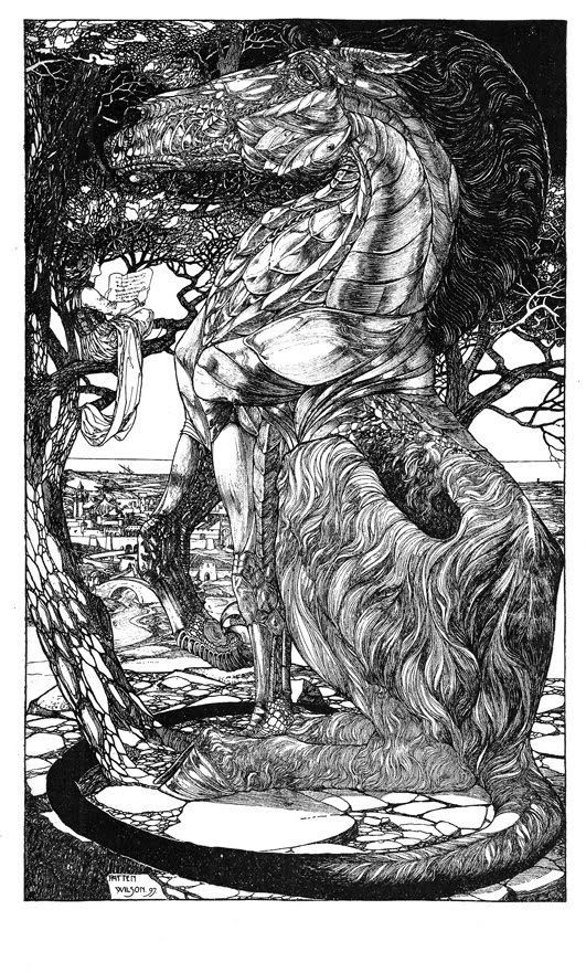
A tome full of great line art and graphics, this lengthy history starts with Albrecht Durer's woodcut prints, hits William Hogarth, William Blake, and mid-nineteenth century masters, meanders through Victorian era early-illustrators, and wraps up with an international tour of some of the best line illustrators from the early 20th century. If you like your illustration art with a more graphic quality—where it's about the drawing—this is your book.

While it contains no color, the drawings and prints it contains (over 400!) and the range of the artists that it samples—make it a great add to the shelf, both as reference and for inspiration. Some of the pieces and styles to get lost in—character designs by W. Heath Robinson, up top, followed by Walter Crane designing pages for William Morris, Edmund J. Sullivan's image from
The Rubaiyat of Omar Khayyam... the source of all of
those Grateful Dead stickers.  Harry Clarke,
fantastically creepy as always, and Franklin Booth,
getting more value out of ink line than anyone else.
Cover image is by Aubrey Beardsley.


Monday, December 19, 2011

Fine Lines and Solid Blacks, V. III.


If you've followed this blog for some time, you know I'm a big fan of the work of British illustrator H. J. Ford. In conversation with a friend recently , we were discussing that appreciation, when he brought up John D. Batten. (1860-1932). I'd been aware of Batten, but I hadn't really explored his work until this came up.

At times in their careers, the works of Batten and Ford might have been nearly indistinguishable. Primarily line artists, both Batten and Ford often relied on intricate frames to surround their scenes, sometimes with a hand-written caption. Both worked in mythology and fairy stories—and both formed partnerships with writer/historians that explored fairy tales, and made minor heroes out of the illustrators to generations of children. The Batten/Joseph Jacobs partnership thrived throughout the 1890s, when they produced six books— English Fairy Tales, Celtic Fairy Tales, More English Fairy Tales, More Celtic Fairy Tales, Indian Fairy Tales, and The Book of Wonder Voyages. Indian Fairy Tales, in particular, yielded some great pieces of ink work. The last three here are from that book—"The Demon with the Matted Hair" is a fantastic piece of creature design. Tusks and a beak. During my undergrad work, long ago, I did a large ink piece with a complex Celtic frame—which I realize now, was modeled after Batten's style.

--------

My first semester teaching History of Illustration and Animation has wrapped up, and I hope to invest more time in the blog again to help it happen more regularly. Have a great holiday.

Monday, May 30, 2011

Fine Lines & Solid Blacks, V. II


William Heath Robinson's A Midsummer Night's Dream

The Brothers Robinson. Throughout the history of illustration— there have been repeated instances of siblings who have found measured success as individual illustrators. Usually there are marked similarities in style and execution, but sometimes there are differences, that will put one ahead of another—at least in commercial success.

In the case of the brothers Robinson, there was not a just pair of brothers, but three. Thomas Heath, (1869-1950), Charles, (1870-1937), and William Heath, (1872-1944). The mutual success they shared is quite amazing, with their total output in Golden Age volumes having tremendous influence, especially when looked at combined. The three of them have far too much to look at or discuss in a single VIEW post, so I'm going to start with the youngest, and by today's measure, the most recognized, William Heath.

As mentioned in the last post, in the current Calla season, one of the volumes I'm particularly stoked about is W. H. Robinson's Illustrated volume of Shakespeare's A Midsummer Night's Dream. W. H. Robinson did do some stellar color work in his career, some of which I hope to show you this summer— but I want to look at the absolutely incredible line art he did for A Midsummer Night's Dream. The book (1914) contained 12 color plates, and 51 line illustrations, many of which were full page. W. H. Robinson had an incredible eye for deciphering contrast, and his inky shadows have some of the best shapes of any line work of the period. Here are a few of my favorite pages and pieces-

W. H. Robinson's career took an unusual turn at the beginning of World War I, when he began designing some strange, complex contraptions (in a comic form) to do simple mundane tasks. This form of cartoon became immensely popular, and while there were dozens of illustrators who could do a fair Fairy-tale page, this kind of design and humor were nearly unique to W. H. Robinson—so he made the most of it, and spent a good deal of his later career doing that type of work.

Jim Vadeboncouer's W. H. Robinson Bio

--------------

Yes, An Edmund Dulac Treasury, my latest compilation work, is now available! Shakespeare Illustrated should be right on its tail, here in a few weeks....

Saturday, February 12, 2011

Fine Lines and Solid Blacks, V.I


February, the Heart of the Winter. I like Winter, it gives me plenty of justification to be locked up in the studio. It's been very busy as of late, a big new painting in its final stages, two books about to leave for press, one "in scanning" and one on deck. Of course, there's even more in the wings. So I've been away a bit, but wanted to give you something interesting to look over.

A few posts ago I mentioned the amount of grayscale work published a century ago, and asked about it's worth to the working illustrator today.
OK.—but there was another medium that ruled a century ago, that is damn near dead now. Pen and ink—was not just cheap and easy to reproduce, it was for my money a legitimate art form in its own right. It's a whole different skill set to make an ink piece sing. Great painters are not necessarily great inkers, and vice-versa. What's a pen-and-ink drawing worth to look at today?

Once and a while, I'll post some of these century old ink pieces, Maybe some by the same artist, maybe some by a group almost forgotten today. I'll call this -Fine Lines and Solid Blacks.

This idea was largely born out of a single volume I came across a while back. Modern Pen Drawings: European and American, edited by Charles Holme, from the offices of The Studio, 1901. I love a good ink drawing—A good one will convey the idea of its contents so well that the viewer doesn't see the line.

When I started doing this, ink was still a way marketable to make a drawing, a publishable drawing. My first published piece was an ink drawing, and my first commission was for about 18 ink pieces.... I'd love to see an art director today request that any piece be done in beautiful, high-contrast, ink.

Here's a bunch from when ink it was at it's peak, by some familiar names, and some not-so-
Top to bottom- Dorothy Smythe, Alice B. Woodward, E. W. Charlton, Percy J. Billinghurst, and Patten Wilson, all Brits.

It should be mentioned that JimVadeboncoeur has been gathering this kind of work for a while now, and publishes them occasionally, calling them Black and White Images, (Fifth) Special Collection. (Ok, there are five now) They are treasuries of great, period ink work—in addition to the other collections Jim puts together—Thanks, Jim, keep up the good work.