Saturday, January 22, 2011

Anton Otto Fischer, 8 years at sea makes a better marine painter


There were a few illustrators to study under Howard Pyle in Delaware that specialized in marine work—meaning they painted a lot of ships and sea related imagery. A century ago ships were a much bigger presence in our lives, being the sole option for travel to Europe, and one to consider for travel almost anywhere from one coast to another. One of the finest marine painters to come through the Brandywine Valley was Anton Otto Fischer. (1880-1962) Fischer was German born, but came to America while in his twenties after spending almost eight years at sea. It was this kind of life experience that Pyle liked to see his students partake in, to give their pictures life, and authenticity. I'd bet it was a feature that Pyle would have embraced in Fischer. In 1910 Fischer caught a break by being paired up with Jack London, and for the next few years he often did work for London's stories.
During World War II Fischer served as an official war artist in the Coast Guard, aboard the cutter "Campbell". During a long career in illustration, Fischer worked for magazines such as Harper's Weekly, The Saturday Evening Post and Life, and was painting private commissions right up to the end.

Check the Post link above- it's a great gallery of some of Fischer's covers.
and there's a large slide show of Fischer work here, though accompanied by some music I can't seem to turn off...
and a great group at American Art Archives

------------

I got news today that my application for full membership to the Society of Illustrators has been accepted. This organization has a rich history from deep in the Golden Age, greatly related to the kind of imagery and work I present here on VIEW. Most of the American illustrators I present here were members of the Society, and it's nothing less than an honor to be carrying on their tradition.

Tuesday, January 4, 2011

The Virtues of Gray?


This post is a question that has recently been tossed about in my editorial head.

A great deal of work in the Golden Age of illustration was published as halftone (or grayscale) art. For every nice color plate I find for a new Dover publication, or to post here on VIEW, I find three that were printed in various tones of gray.

My question is— Does that work hold any value and or interest to this audience today? I'm not speaking about the general public, I mean people who are fans of illustration for whatever reason, and who are usually the ones who throw down a few bucks for a Dover collection of Golden Age images? If you've been tempted to comment in the past but haven't, or even if you have, THIS IS YOUR WEEK. Throw me some comments, let me know, it could—no, will—affect the selection and layout of my next book to be submitted....

SO—To help the discussion, or at least what I hope will be one, I've picked a few pieces of grayscale art that I have found worth looking at more than once. I don't want to influence your comments on this, so I'll just give you the facts, and you tell me, does this material merit some study, would you pass it up, or is it as worthwhile as a similar color plate?

This first piece picks up on the last entry- The Prospector is an N. C. Wyeth piece from a McClure's Magazine, 1906.
Wyeth's teacher follows, that's Howard Pyle with Blackbeard's last fight, Century Magazine, 1894.
Sydney M. Chase is weighing the fish from Scribner's, June, 1908.
Fourth is Woldemar Fredirich, with a scene of "The Wild Huntsman" from The Illustrator, 1895.
and last is George Wright, with the firefighting scene, Scribner's, 1902.

Let me know if this kind of imagery is welcome in a book you might buy today, and why. Comments encouraged.

Monday, December 27, 2010

Snowday, Wyeth style


I start this post in the immediate aftermath of a Northeast blizzard, one strong enough to shut down the railroad, and grant me a snow-day to follow the Christmas break.

It occurred to me that a new bunch of N. C. Wyeth (1882-1945) prints that have trickled into the studio share this wintry vision. Living where I do, it's not uncommon to see some snow on the ground from December to March, and it always surprised me that it doesn't show up in more work, from anyone who lives in the north. N. C. must've liked the snow as well, because looking over a group of his early works, a large percentage of them are snow scenes, including one of my most favorite Wyeth pieces. Seemed like a good theme to explore on a snow-day. Without taking it for granted—Newell Convers Wyeth is one of the most important illustrators of the twentieth century. He joined Howard Pyle, studying under him at the Brandywine, and Wyeth soon became Pyle's star pupil. Wyeth had an incredibly prolific career in both book and magazine work. He was also the patriarch of what became America's first family of art, with his son Andrew Wyeth, and grandson Jamie Wyeth being the central figures of three generations of Wyeth artists.

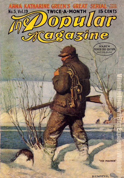
The images— a few nice covers from The Popular Magazine, including this cover with a Yukon adventure look to it- Polar bear, Native Americans, a trusty Colt .45. A second features one of N.C.'s strong solitary thinkers, in this case, a poacher...
A few plates from The Outing Magazine, January 1907- from a story entitled "How they Opened the Snow Road"
and a pair of plates from two classics—
The frontispiece from Mark Twain's last novel, The Mysterious Stranger (a read which I enjoyed tremendously in my college days)
and a piece I have the highest amount of respect for, from Robert Louis Stevenson's The Black Arrow, (also a good read)

Wyeth used snow in many of these pieces the way he used dust in his even earlier (or contemporary) western themed works—providing a light field, it helps him to increase contrast and strengthen shadows. He also frequently simplified figurative areas into definitive shapes, and obscured the details of distant backgrounds that would otherwise distract from the focus of the piece.

Stay warm. See you in the New Year, here's to a good one!

Saturday, December 18, 2010

Ring out Solstice Bells


The Solstice arrives this coming Tuesday. Marking the longest night of the year, it has special meaning to many people. This year's is especially spectacular, as it is not only coupled with a full moon, but also a FULL LUNAR ECLIPSE, visible all over the US. Holy Druids.

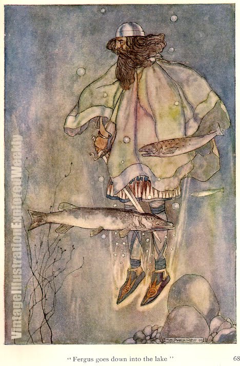
These old-world calender events always make me think of the myths and legends that make use of such happenings. Having just acquired a long sought-after book featuring some great pieces from Celtic myth, this seems like an appropriate enough occasion to share them.

Stephen Reid (1873-1948) is not a name you will come across in any (but the most thorough) of the books on Golden Age illustrators. His work was very good when he was at top form—but it was not always consistent. In his later work he went to an opaque medium, and lost a good deal of the sensitivity he captured here. Reid managed to hit a lot of the subjects I am passionate about—pirates, medieval history, and Celtic myth. These first four plates are a selection from The High Deeds of Finn and Other Bardic Romances of Ancient Ireland, by T. W. Rolleston, Harrap. 1910. This is what I just got a hold of, happy centennial, Finn. Featuring Reid's earlier watercolor work, his palette choice and usage of transitioning color manages to lend a nice dream-like feeling to these pieces, which benefit the faerie/other-worldly aspects of the setting. The last image is from an even earlier work, by Eleanor Hull—which is one of the pieces that inspired me to hunt down these color plates. I have a copy of that volume with the color on the way...I'll post those for St. Patrick's day. . .

-----

Speaking of "working Joe" illustrators—
One of the things I love to do here is find the folks who gave a real go of it, but never achieved the stardom of those few—and might have gotten lost a bit in the past 100 years or so. Reid definitely fits that category. He seemed to stick around for a while, I guess he was a nice guy who handed in his work on time, but maybe didn't do AWESOME work all of the time.
This past week I found another blog entry who looked at this situation with real insight. Let me share that with you, and thanks to David Apatoff at Illustrationart for putting these thoughts down.

-----


Be careful with your golden sickle cutting the mistletoe.